An avant-garde group like Koresh Dance Company deserves a site as exuberant and engaging as their performances.
An avant-garde group like Koresh Dance Company deserves a site as exuberant and engaging as their performances.
Deliverables: strategy, creative direction, design, and consultation
↓

Koresh Dance Company (KDC) is renowned for its captivating performances and exceptionally skilled dancers. With critically acclaimed productions staged in Philadelphia and nationwide, KDC has also garnered international acclaim through tours to Spain, Turkey, Israel, South Korea, Mexico, and Guatemala.
Challenge:
How can we attract a new audience demographic to embrace the company's offerings and attend performances, while simultaneously maintaining strong connections with existing patrons?
RESEARCH
Why isn't the company selling more tickets online?
We conducted interviews and online surveys to identify key factors that foster loyalty and contribute to long-term business success. Additionally, we aimed to understand the reasons behind the departure of current users from the website before reaching the sales portal. Our inquiries delved into the emotional attachment customers feel towards the company, their frequency of online purchases, and their perceptions of the site's usability.
In total: 8 Interviews + 22 Survey responses
KEY INSIGHTS
01 Low demand for online access
02 Question legitimacy of ticket module
03 Need for easier event filtering
04 Unclear if account holders are active
05 Need for mobile application
APPEARANCE
“The site looks like it needs an update. I tried to see it on my phone and everything was really small.”
OLIVIA, DANCE FAN
FILTERING
“I would love it if it was easier to search for shows based on dates or locations.”
PILAR, CURRENT PATRON
PAYMENT
“When I try to pay for a performance, the page design changes. When that happens, it feels shady to me.”
ALISTAIR, POTENTIAL PATRON
ALISTAIR, POTENTIAL
STRATEGY
To increase user engagement and interest, Koresh Dance Company had to improve both the interface and functionality of their website to encourage visitors to intuitively explore the features and information presented on all pages.
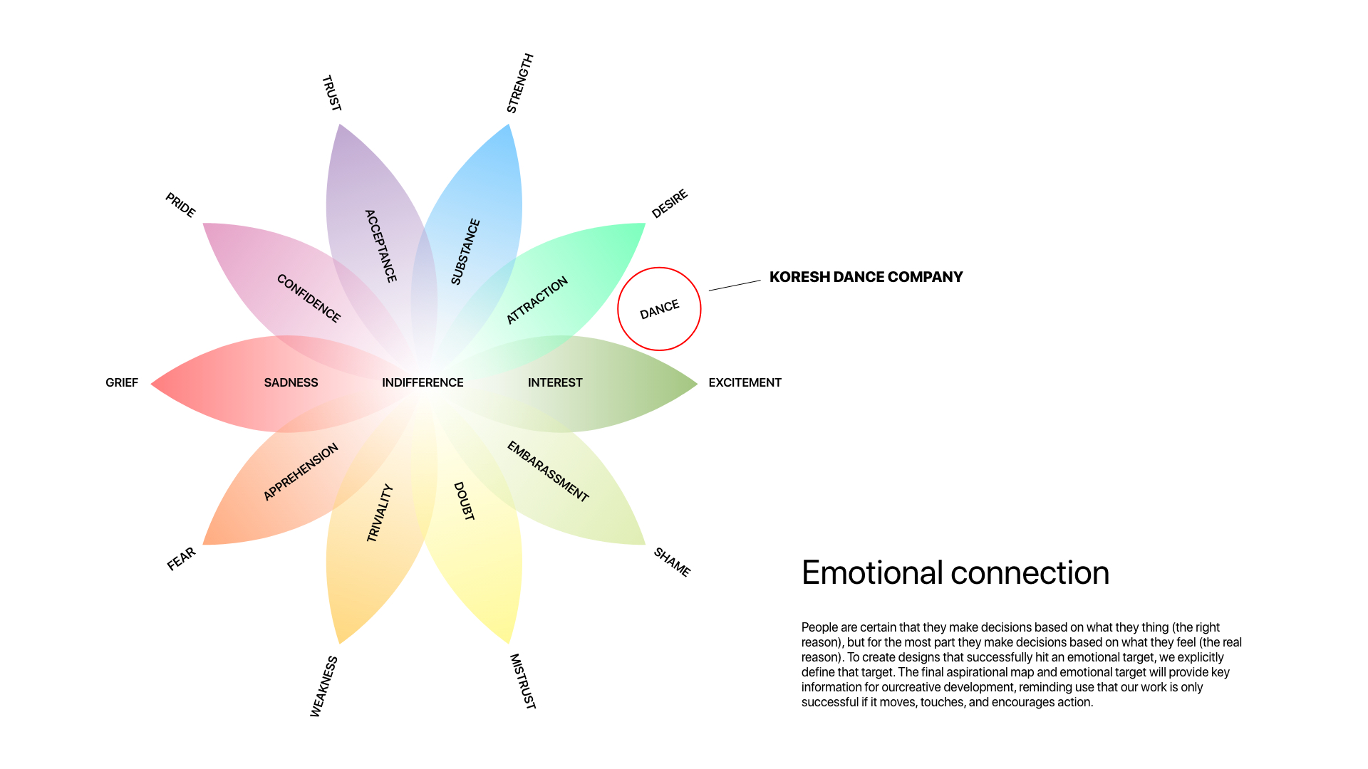
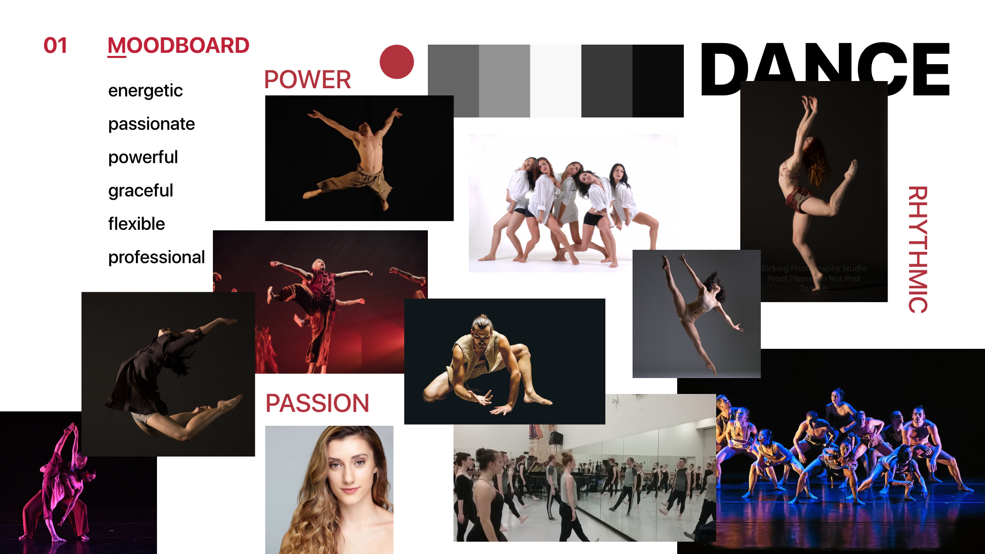
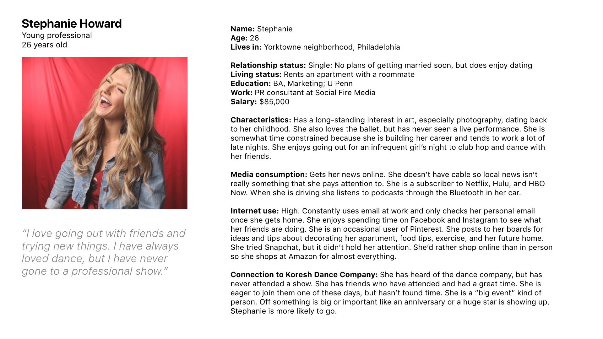
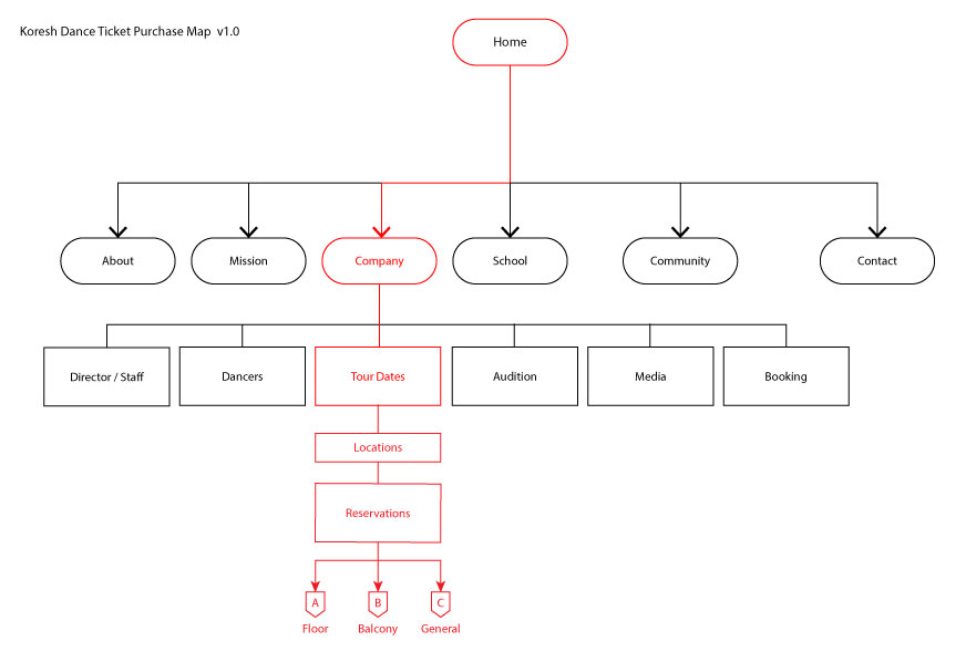
While Koresh's primary audience consisted of Gen Xers and Baby Boomers, the company sought to engage a younger demographic. To address this, we created research-based personas that informed our design decisions, ensuring alignment with the evolving expectations, challenges, behaviors, and goals of the new target audience.
Moreover, we developed an emotion matrix to better understand the company's positioning in the hearts and minds of its audience. This insight was pivotal in shaping our content strategy, allowing us to effectively connect with the audience on a deeper emotional level.
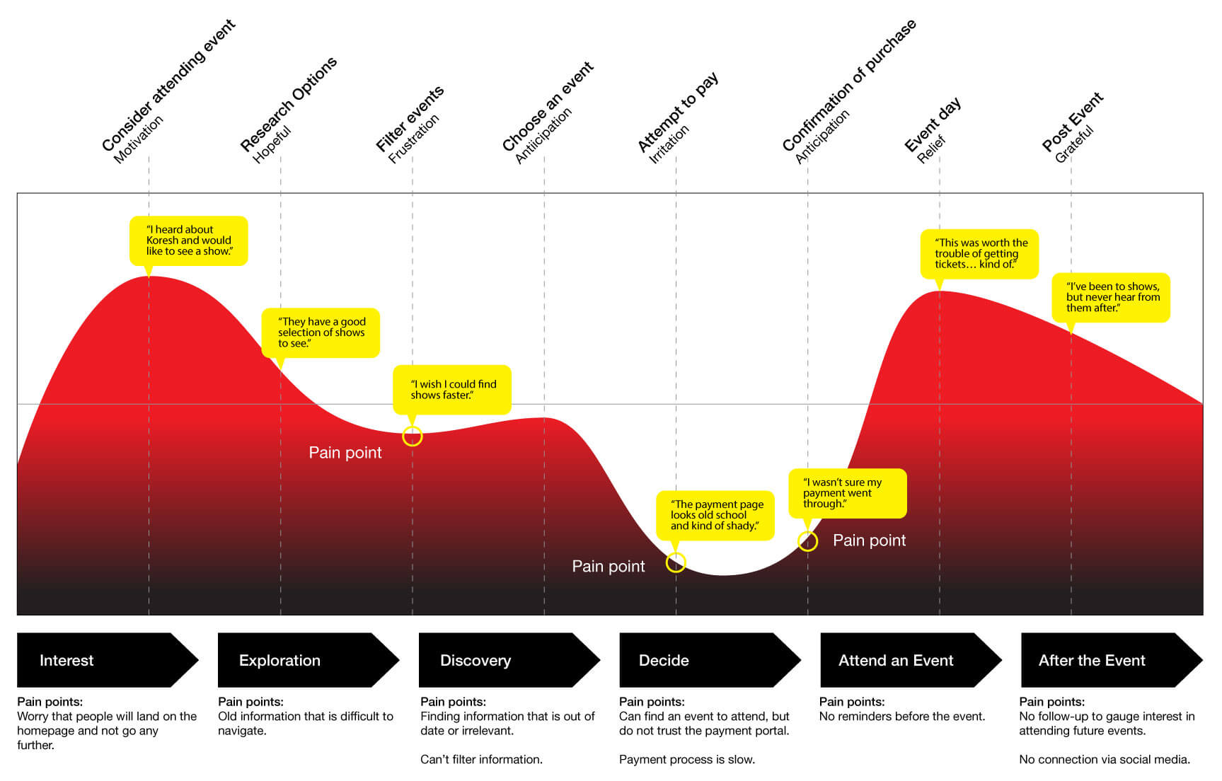
BUILD, TEST, AND ITERATE
Drawing from the insights gathered, we crafted prototypes ranging from low to high fidelity, refining them through rigorous testing and iterative processes. User testing proved instrumental in uncovering issues and challenges across each design iteration.
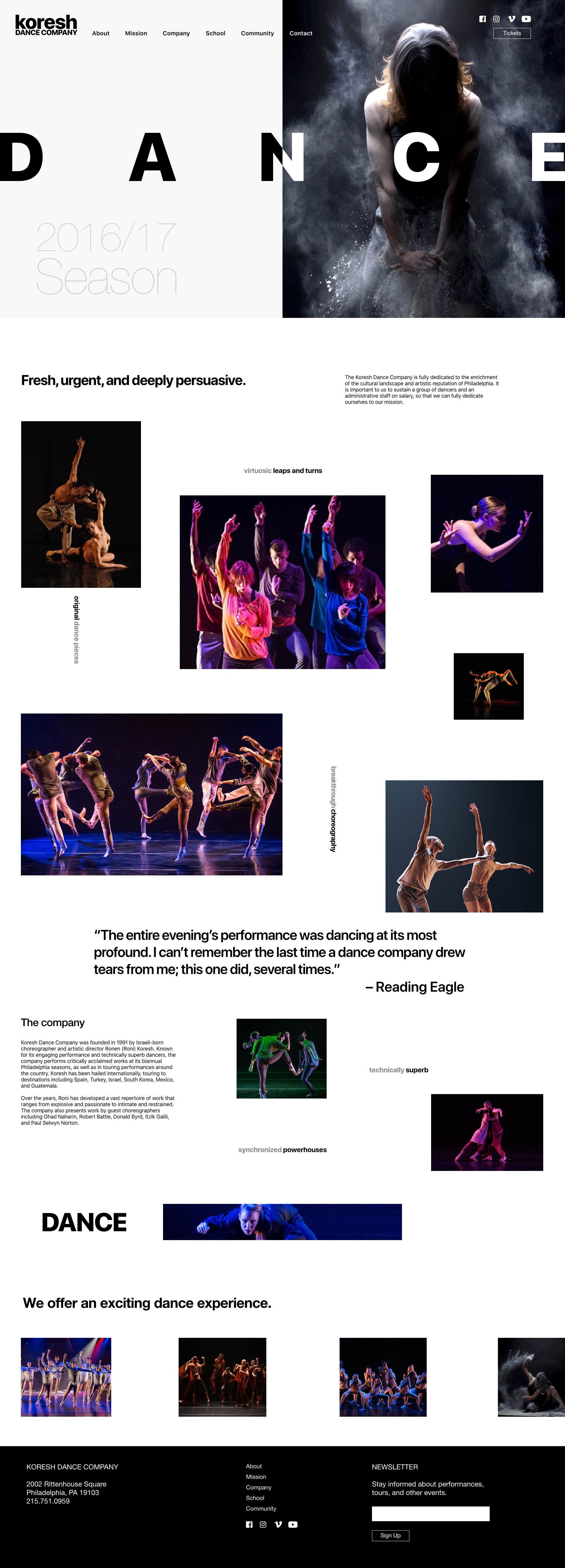
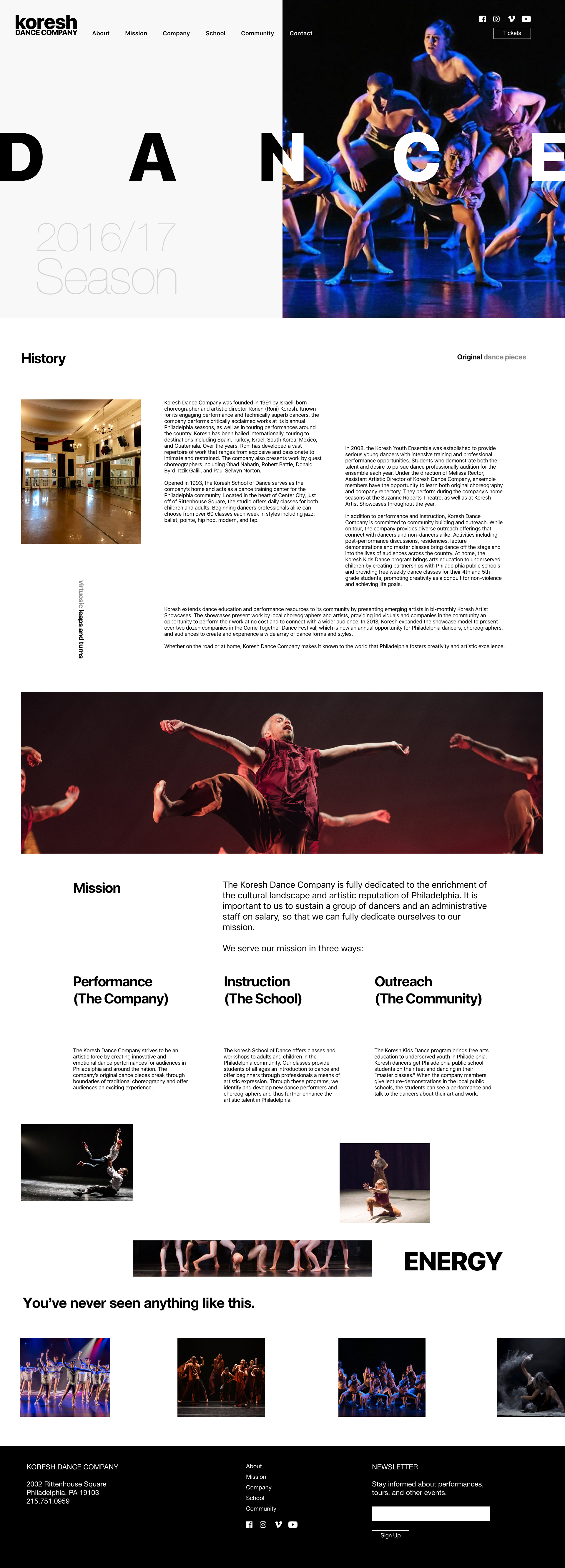

DESIGN MOCKUPS
Mockups were designed and brought to life through prototypes using Sketch and InVision Studio, empowering the client to engage with the envisioned desktop and mobile experiences. This interactive approach facilitated the validation of the new design options.
Pain Points addressed:
- Too much long-form copy: To improve readability, we shortened content rows for faster consumption.
- Colors feel random: We employed a minimal color palette to create a timeless aesthetic, replacing random color choices.
- Too much information on pages: Introducing more white space helped declutter pages overloaded with information, keeping layouts clean and inviting.
- Images are small or pixellated: We replaced small or pixelated images with large, clear visuals to captivate users and enhance engagement.
- Some pages don't have hardly anything while others are crowded with information: By conducting an inventory of all pages, we achieved a balanced visual rhythm throughout the site, ensuring consistency in both content and imagery distribution.

Koresh Dance Company is dedicated to enhancing Philadelphia's cultural landscape and maintaining its reputation for innovative performances. To support this mission, we developed a comprehensive visual communications strategy that included promotional materials, advertising campaigns, out-of-home media, and digital executions.
RESULTS
The result was a dynamic design system and visual language, characterized by ample whitespace, that successfully engaged a new generation of potential patrons while retaining the loyalty of existing ones.
← prev
next →
Copyright © 2024 Eleazar Hernández | All Rights Reserved

