Typography as Choreography: Visual Strategy for Koresh Dance Company’s Festival Launch
Collaborated with Koresh Dance Company on a fast-paced project to promote a five-night festival celebrating Philadelphia's rich and diverse artistic landscape.
Deliverables: Visual strategy, Typographic exploration and creative system development, Art direction and design, branding system, Asset toolkit, Strategic consultation, Scalable design framework optimized for both in-person and digital event promotion
↓

KORESH DANCE COMPANY — “WHEN FORM MEETS MOTION”
A Visual Strategy for a Rapid-Turn Festival Campaign
Koresh Dance Company (KDC) is internationally acclaimed for performances that blend emotional power with technical precision. For a five-night festival celebrating Philadelphia’s diverse artistic scene, KDC needed a campaign that could be concepted, designed, and deployed quickly, without sacrificing impact.
The Challenge:
How do you create a compelling, multi-platform campaign with limited assets, tight timelines, and high creative expectations?
Our Strategy:
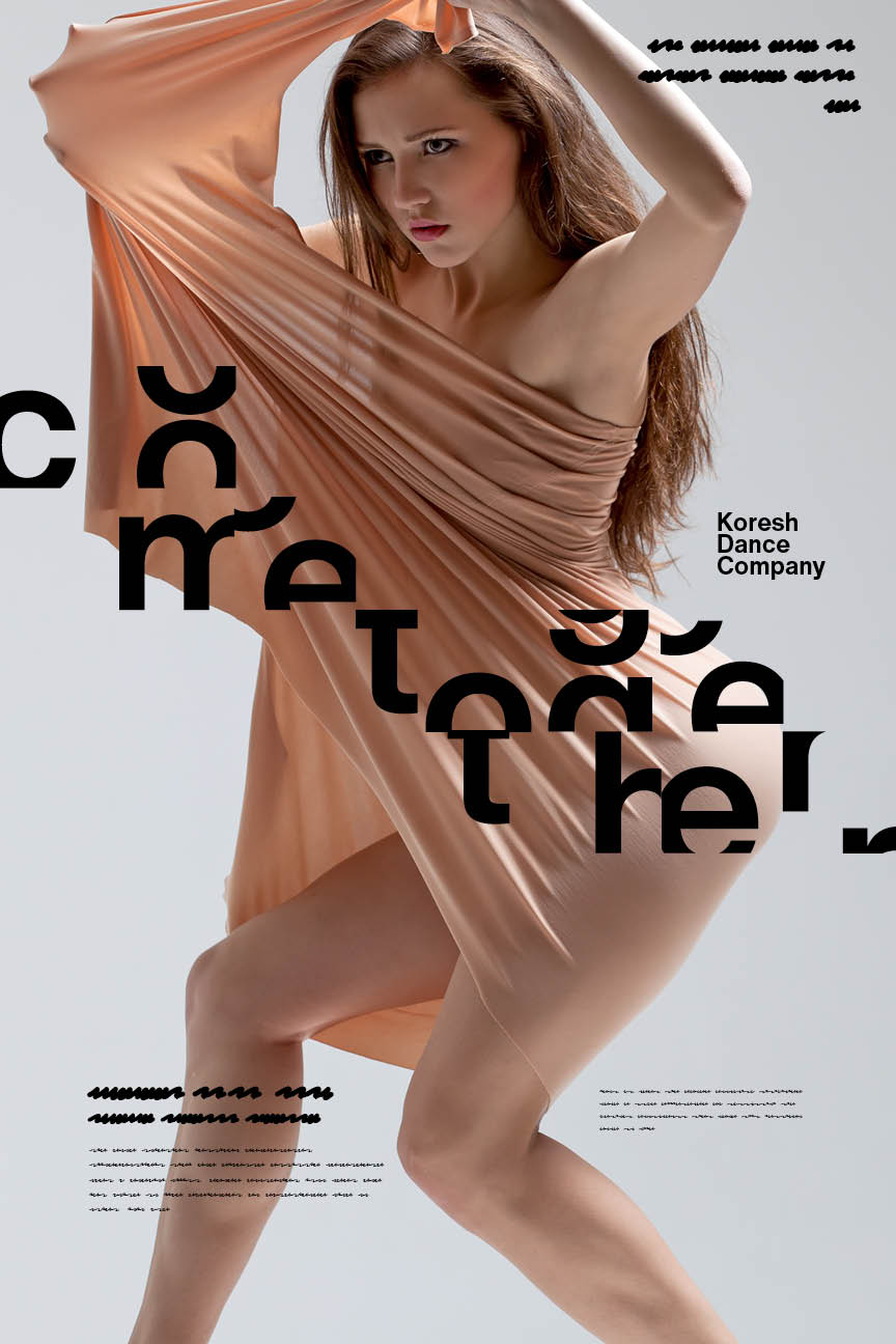
Engage viewers through typographic intrigue and visual reduction, a bold approach designed to spark curiosity, invite interpretation, and reward interaction.
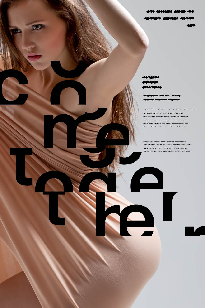
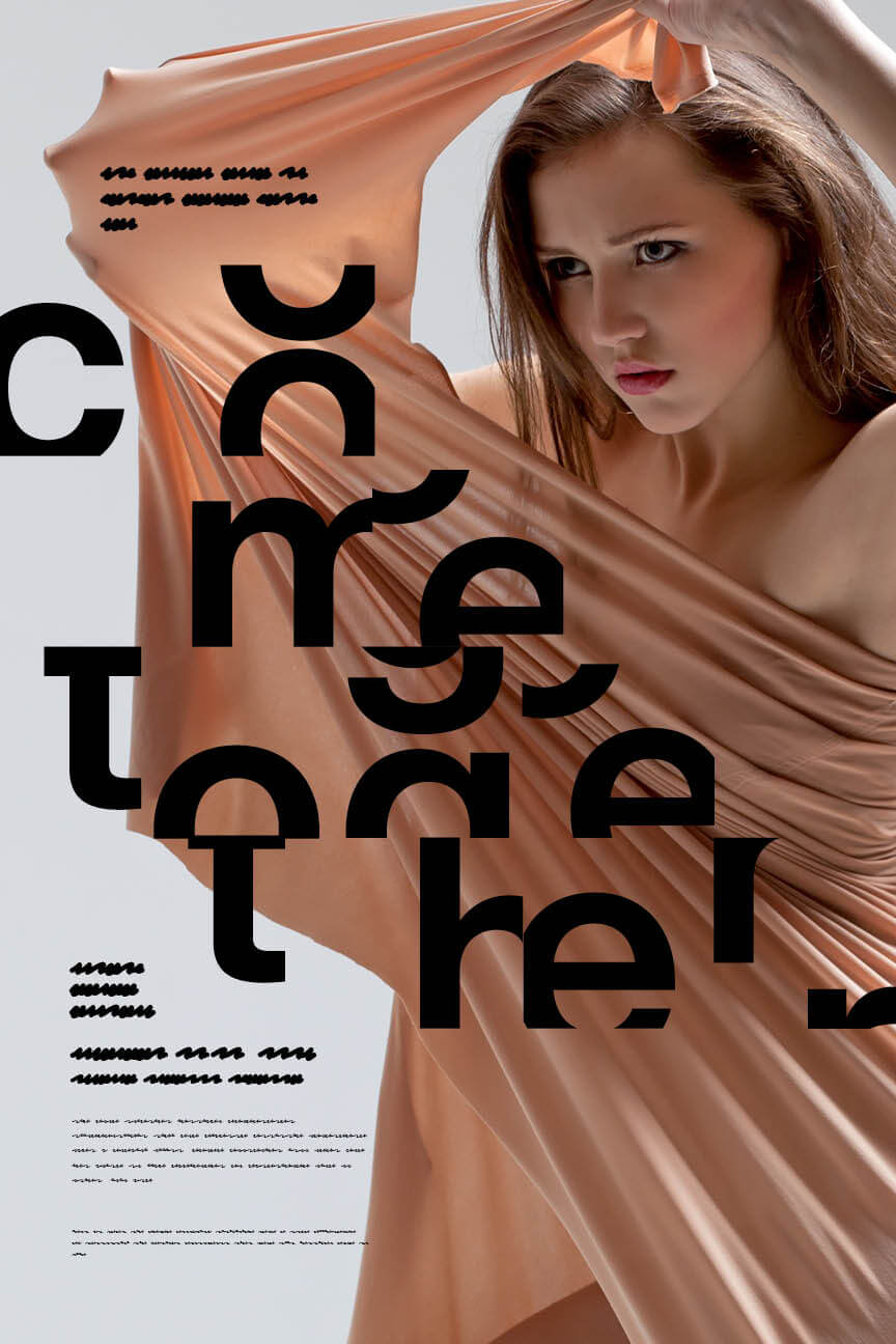
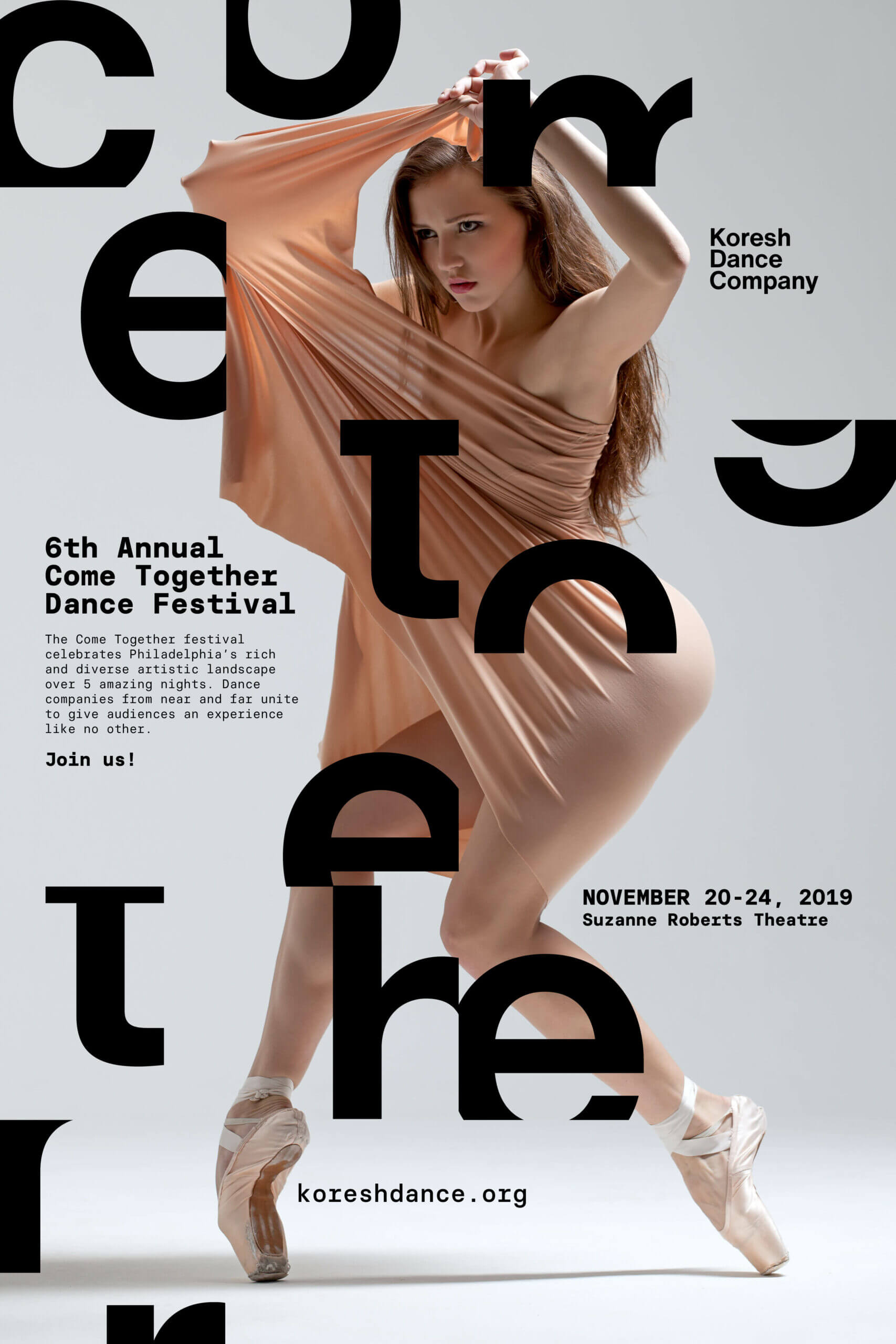
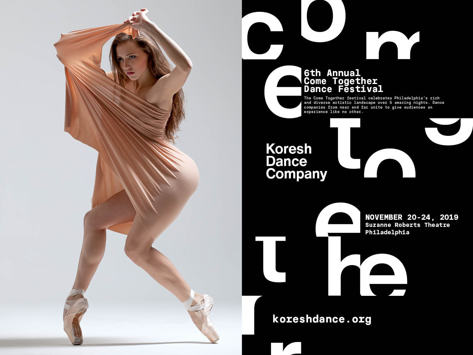
With minimal photography available, we leaned into typography as our storytelling anchor. We selected Helvetica Now, not only for its clean, modern structure, but also for its cultural resonance with the New York dance scene. Its expanded set of alternate letterforms gave us room to experiment… so we did.


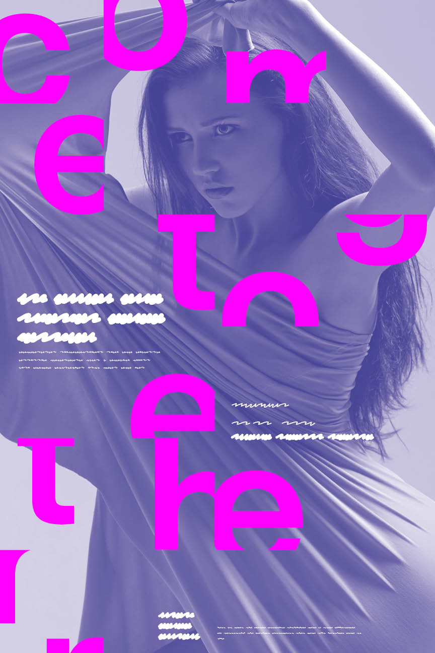
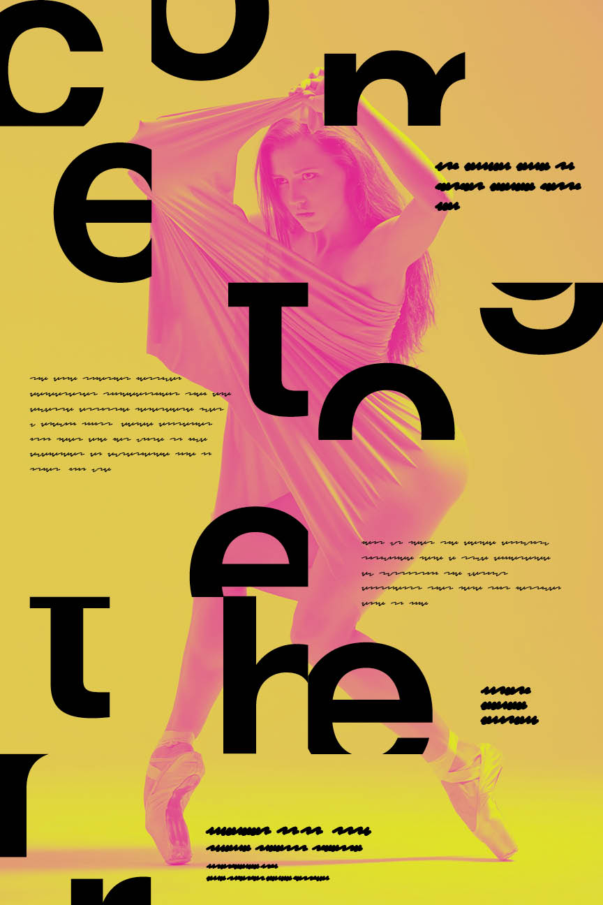
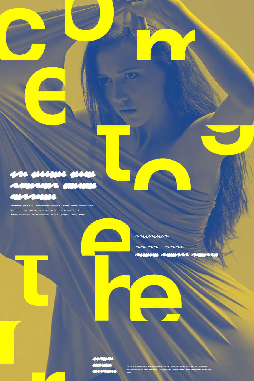
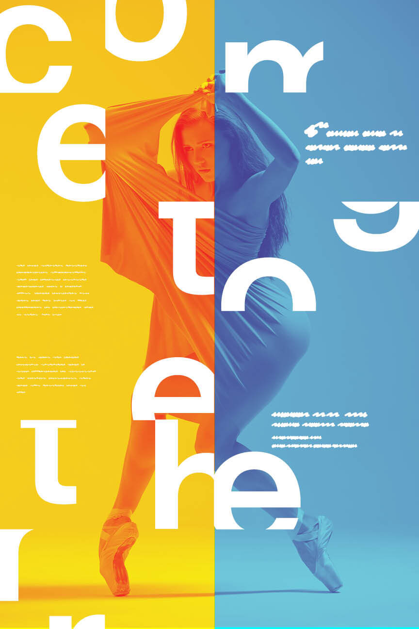
We deconstructed key letterforms to suggest movement and convergence, embracing Gestalt principles like proximity and closure to challenge viewers to mentally complete each phrase. Every visual choice was intentional:
- Scale to control hierarchy and draw the eye
- Rhythm to echo the movement of dance
- Balance to create harmony across asymmetrical elements
- Color theory to complement form and drive emotional tone

The result was a striking series of posters and digital assets that blurred the line between language and movement, just like the performances they promoted.
Implementation + Impact:
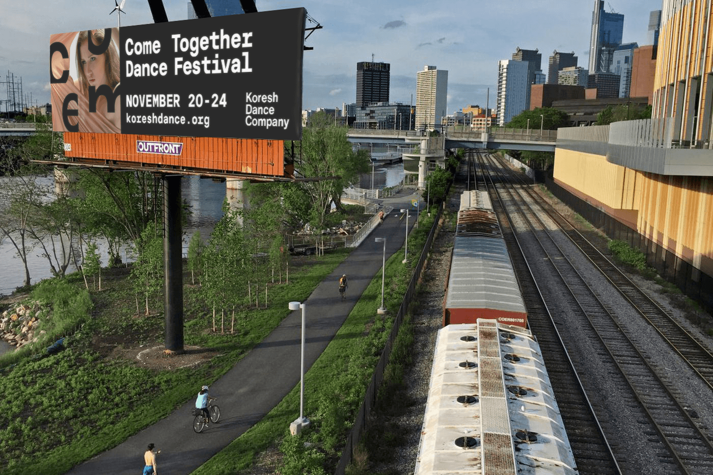
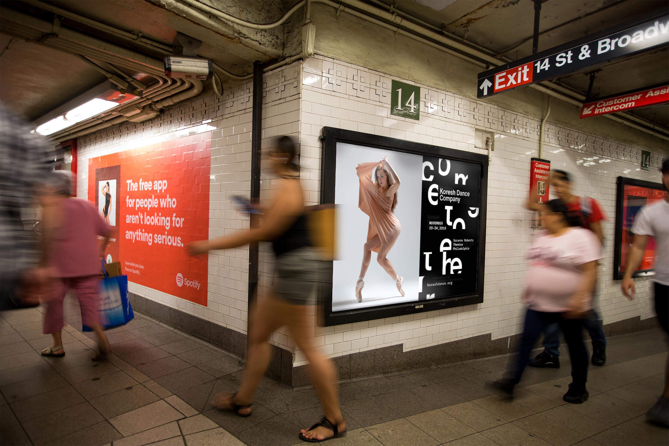
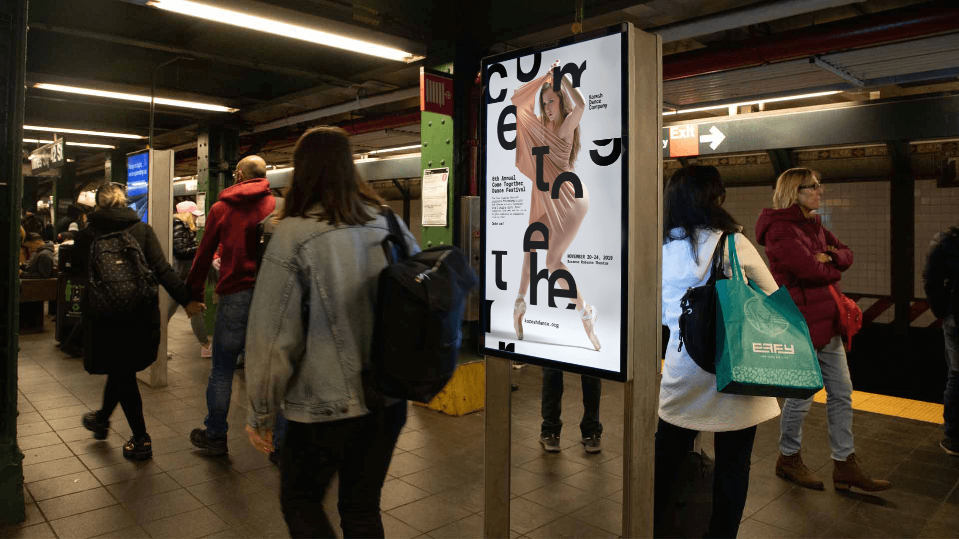
The final designs were rolled out across Pennsylvania and New York in a multi-platform deployment that included street posters, out-of-home placements, and digital and social media assets. Despite a compressed timeline and limited raw materials, the campaign generated strong visibility and public engagement, drawing attention not only to the festival but also to Koresh Dance Company’s bold, modern identity. The typographic approach stood out in a city saturated with traditional arts marketing, positioning the festival as progressive, unexpected, and worth decoding.
By focusing on visual abstraction and conceptual clarity, the campaign invited audiences into an interactive experience—one that asked them to lean in, piece together the message, and, in doing so, become part of the artistic process. This blend of intentional restraint and expressive experimentation helped Koresh reinforce its position as a creative force in the Philadelphia arts scene, while also reaching new audiences through curiosity, clarity, and modern design. The client praised the work as both visually provocative and strategically sound, a system that balanced art and accessibility with just the right amount of intrigue.
← prev
next →
Copyright © 2024 Eleazar Hernández | All Rights Reserved
