The Neighborhood Clinic Grows Up Without Growing Apart
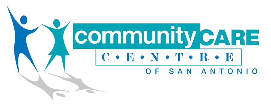
Barrio Family Health Centers wanted an overhaul their brand to change public perception and stop being thought of as "that place that treats the uninsured or low-income people" of San Antonio.
Deliverables: Visual strategy development, Brand architecture, naming, Messaging framework, Visual identity system, Design direction, and Multi-platform communication tools
↓

COMMUNICARE HEALTH CENTERS
Reimagining a neighborhood clinic to reflect care, credibility, and community.
Barrio Comprehensive Family Health Center’s story began with Sister Dolores Girault, D.C., a retired nurse and pharmacist with a passion for serving the underserved. What started as a two-exam room pediatric clinic in the back of a church on San Antonio’s West Side had grown into a comprehensive healthcare system offering primary and specialty care across the region.
But growth brought new challenges. Despite offering a wide range of high-quality care, the public still perceived Barrio as "that place for uninsured or low-income people." Internally, the team recognized that their brand hadn’t evolved with the quality or breadth of their services. They needed more than a visual update, they needed a complete brand transformation that would honor their legacy while preparing them for the future.

STRATEGY
We began with a brand audit, reviewing existing touchpoints and identifying gaps between perception and reality. The insight was clear: to build trust and expand their reach, we had to shift the narrative from limitation to empowerment, without losing their strong connection to the community.
We explored dozens of naming options and identity systems that balanced professionalism with warmth. The name CommuniCare rose to the top. It conveyed clarity, connection, and care—everything the organization stood for. Paired with a vibrant new logo and color system, the new name embraced both medical credibility and neighborhood familiarity.



EXECUTION
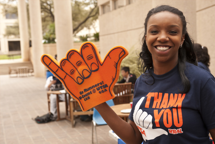
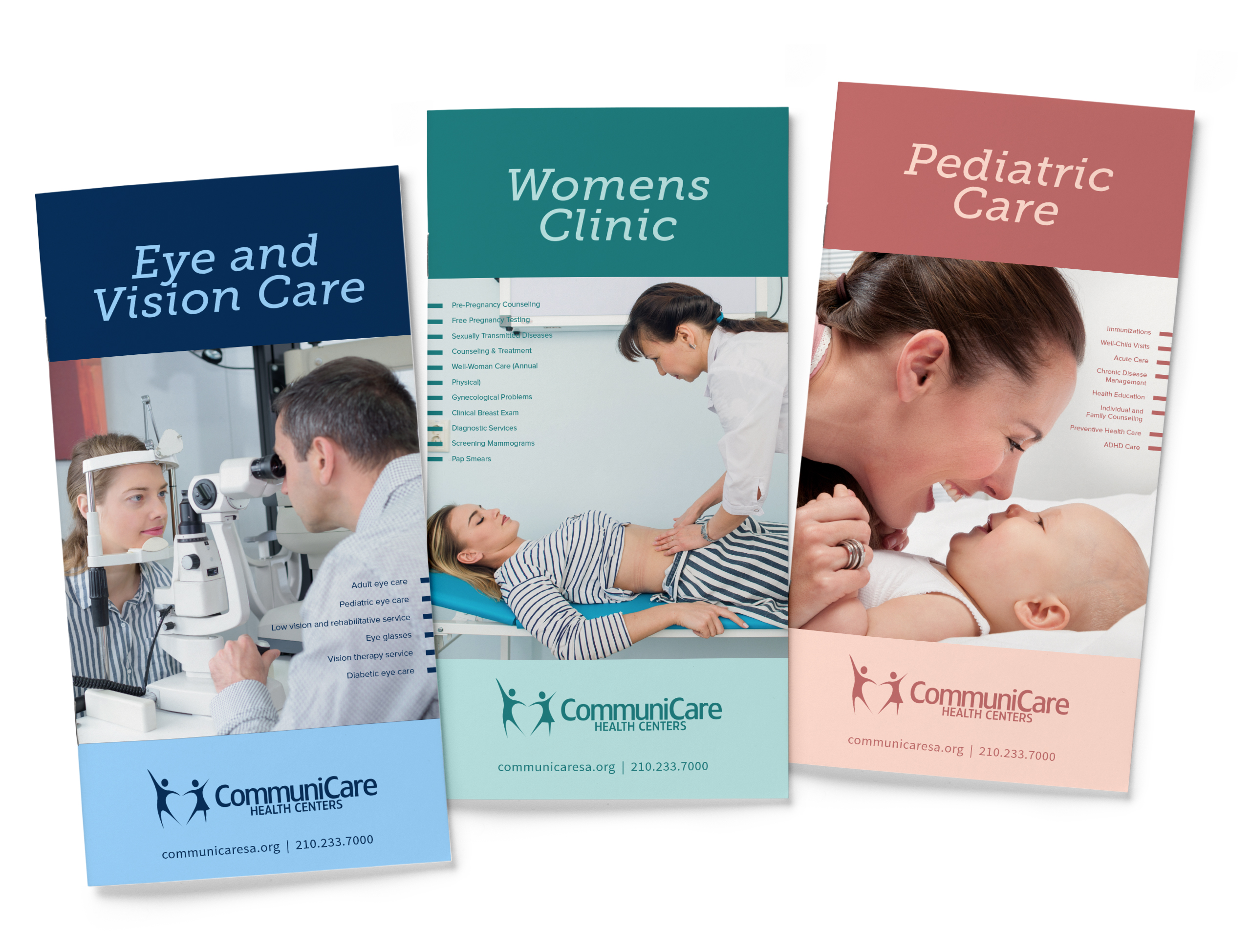
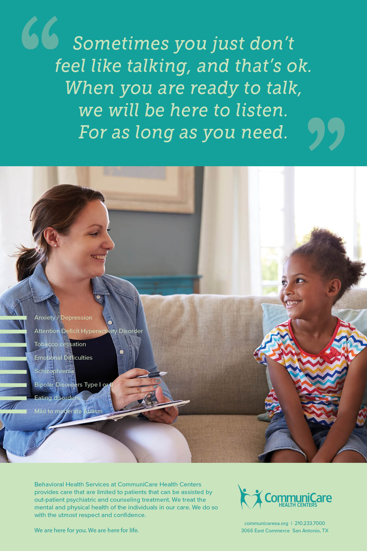
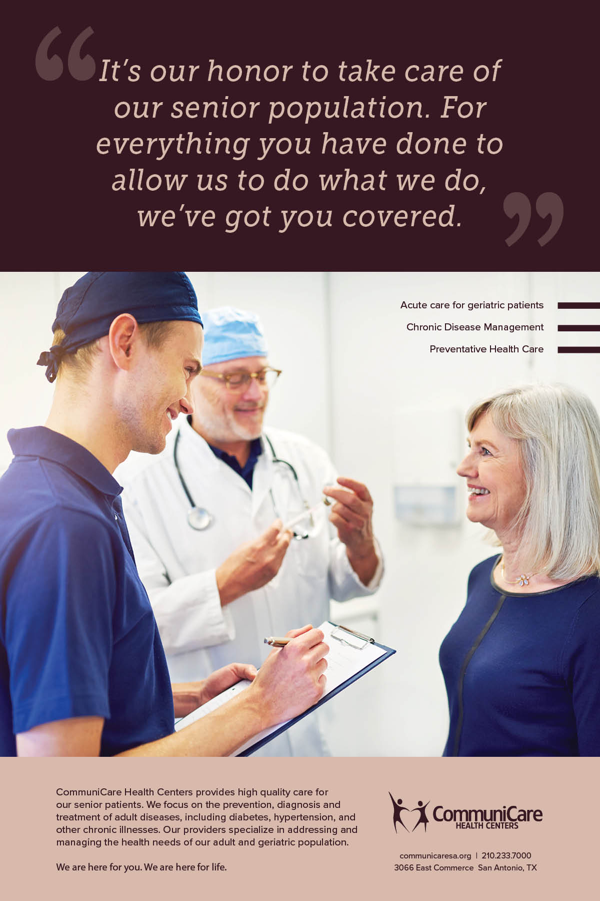
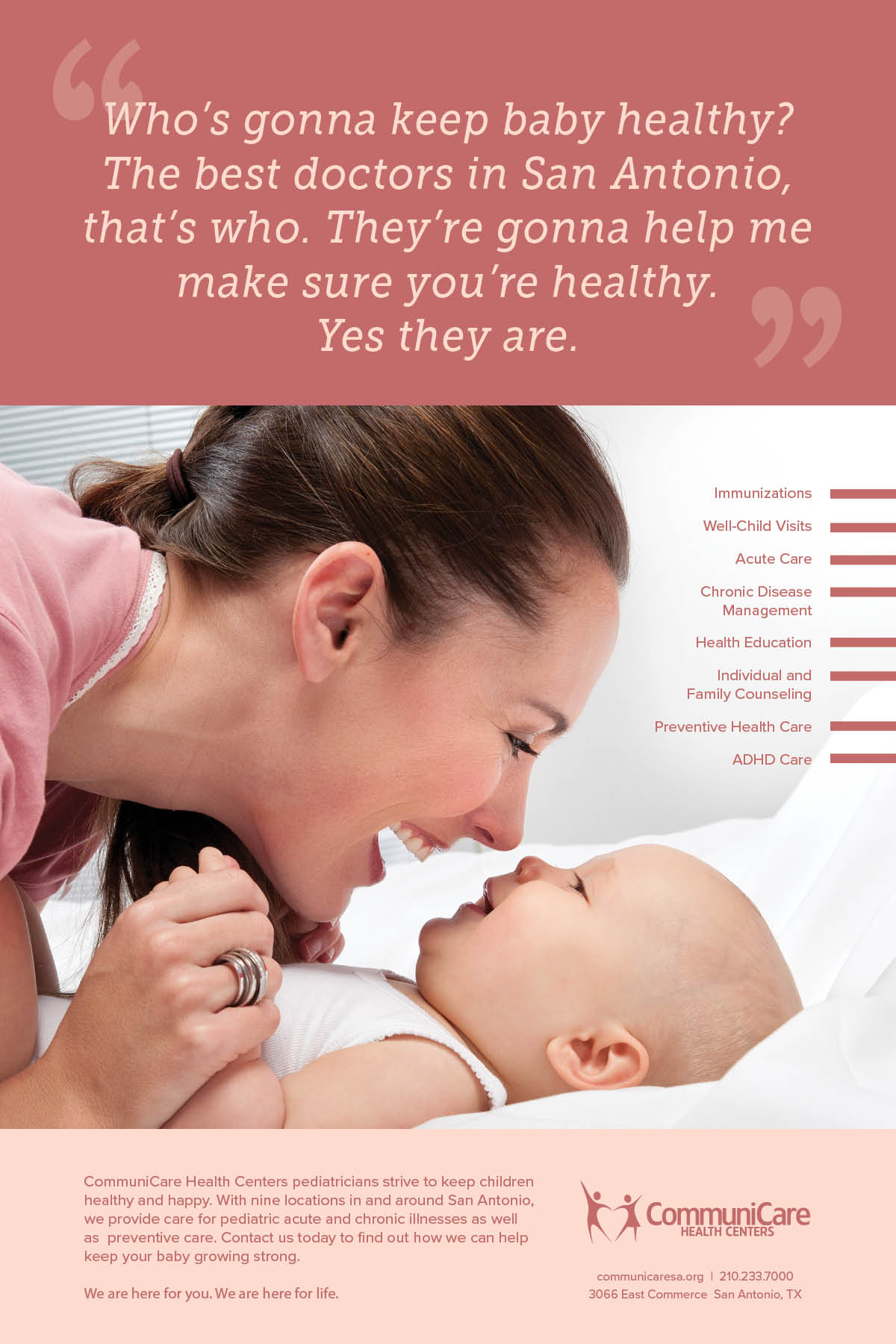
The visual identity was designed to feel both modern and human. We established a flexible system that worked across clinics, community events, and health education materials. Bright colors, approachable typography, and photography celebrating real families replaced cold, clinical design.
We crafted a full set of brand guidelines and collateral materials:
- Patient brochures and handouts
- Posters and clinic signage
- Provider business cards and referral pads
- Website visual direction and content consultation
- Internal brand messaging and launch toolkits
BRAND VOICE
To reflect their welcoming approach, we developed a new tone of voice: clear, warm, and occasionally witty. From brochures to billboards, the voice reminded people that quality care wasn’t reserved for the privileged—it belonged to everyone.
“Yes, we take your insurance. And your questions. And your toddler’s tantrum in the waiting room.”
This subtle shift added humanity to healthcare, resonating with both existing patients and new audiences alike.
RESULTS
With a new name, new identity, and revitalized messaging, CommuniCare was ready to enter a new chapter—one defined by dignity, inclusivity, and growth. The rebrand helped shift public perception from a clinic of last resort to a healthcare partner of choice. More importantly, it gave patients a brand that made them feel seen, welcomed, and cared for.
← prev
next →
Copyright © 2024 Eleazar Hernández | All Rights Reserved


