Turning Pressure Into Power: The Visual Strategy Behind Kretchmer’s Global Advertising Breakthrough
After a public relations snafu, Mi Pueblo wanted to refresh their image with the public and emerge as a dedicated community partner.
After a public relations snafu, Mi Pueblo wanted to refresh their image with the public and emerge as a dedicated community partner.
After a public relations snafu, Mi Pueblo wanted to refresh their image with the public and emerge as a dedicated community partner.
After a public relations snafu, Mi Pueblo wanted to refresh their image with the public and emerge as a dedicated community partner.
Deliverables: Visual strategy and brand positioning, Concept development, Creative direction, Art direction, Campaign Development, Messaging strategy, Consultation
↓
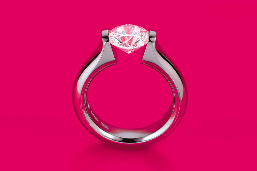
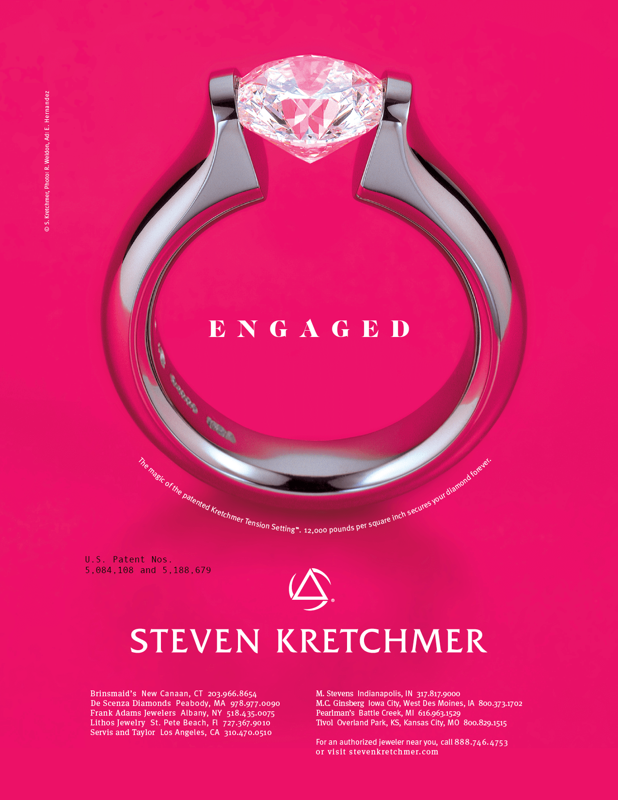

STEVEN KRETCHMER — “DESIGNING THE IRREPLICABLE”
Global Visual Strategy for Jewelry’s Most Revolutionary Designer
Steven Kretchmer wasn’t just a jewelry designer, he was a force of nature. Famed for his invention of blue gold, purple gold, and his revolutionary Tension-Set™ and Polarium™ designs, Steven’s work pushed the boundaries of physics, aesthetics, and imagination. But communicating that level of brilliance to the world? That required a different kind of alchemy.
A Memorable Creative Partnership Fueled by Precision and Velocity
Working with Steven was both exhilarating and exhausting. His standards were microscopic—literally. His feedback often felt like it came through a jeweler’s loupe, and every design decision required justification by craft.
But where others would stop at five ideas, we generated fifty. One all-night brainstorm yielded nearly thirty fully formed campaign concepts, each rooted in the same goal: separate Steven’s designs from every other luxury jeweler on the planet.
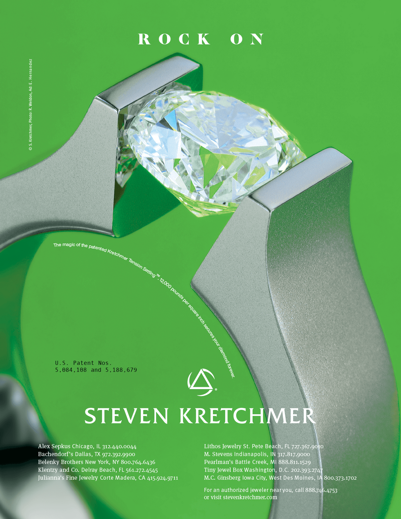

Strategy: Don’t Compete. Redefine the Category.
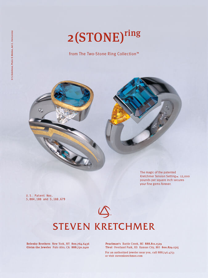
Steven’s rings weren’t just beautiful, they were physically and visually impossible to replicate. With perpendicular and lateral tension settings that made stones appear to float, his work needed a campaign that felt equally otherworldly.
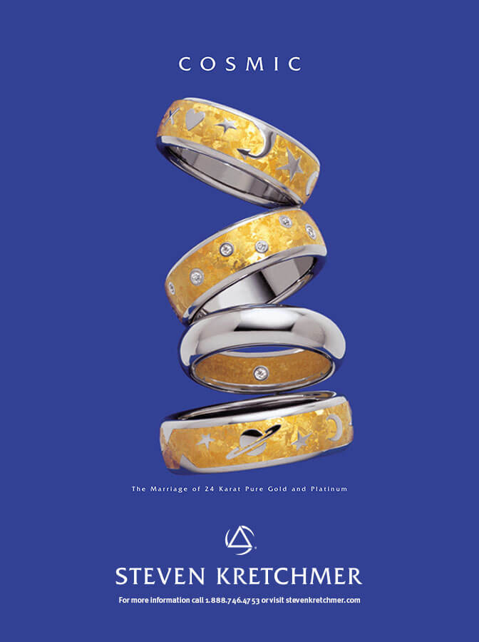
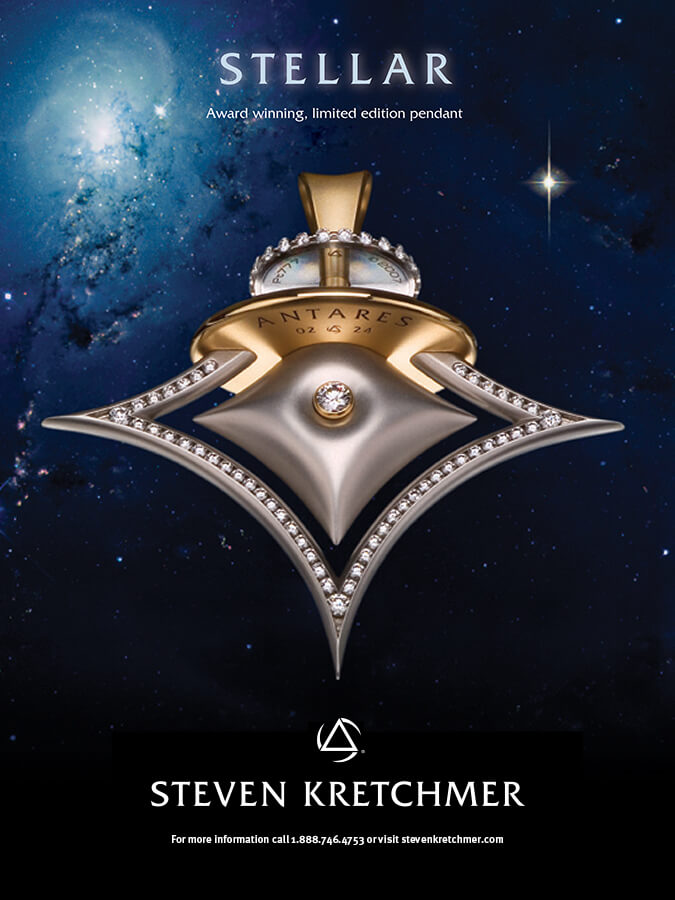
Instead of playing into the category norms of black velvet backdrops and hushed elegance, we went loud. Bold color fields, monumental photography, and minimal copy gave his tension-set rings the spotlight they deserved. Every layout was designed to stop readers mid-page and make competitors rethink their entire aesthetic.
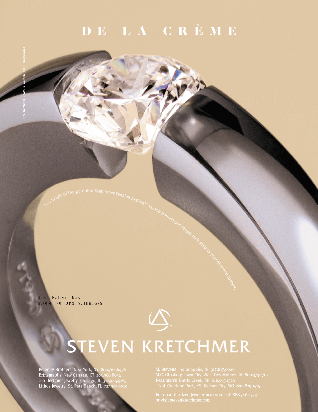

“Loud and Proud” Campaign: A Global Launchpad
The campaign broke through. Print ads, direct mail, out-of-home, and supporting collateral earned Steven coverage in major industry publications and design features across the U.S., France, and Switzerland. What began as a single campaign evolved into an enduring visual platform for the brand.
Legacy Through Continuity
After Steven’s untimely passing, I continued working with his daughter to evolve the brand. While the product line expanded, the strategy remained grounded in the same core truth: no one could do what Steven did, and the visuals needed to honor that singular brilliance.
← prev
next →
Copyright © 2024 Eleazar Hernández | All Rights Reserved

