UTSA launched a capital campaign to raise $150 million. They needed a site that could showcase their goals and keep the public informed about their progress.
UTSA launched a capital campaign to raise $150 million. They needed a site that could showcase their goals and keep the public informed about their progress.
Deliverables: design, creative direction, content development, and consultation
↓
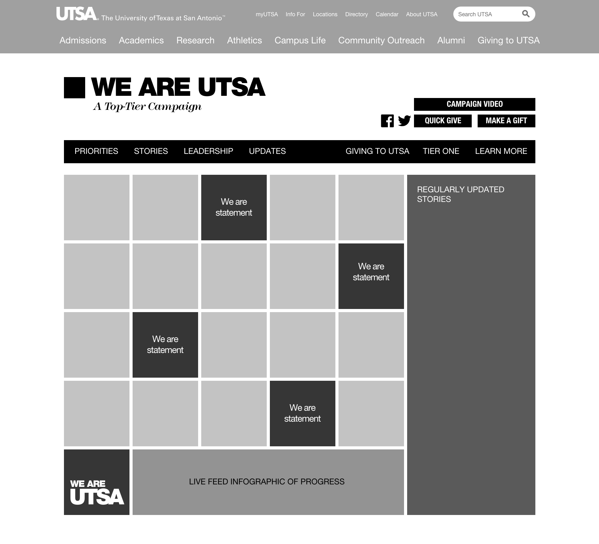
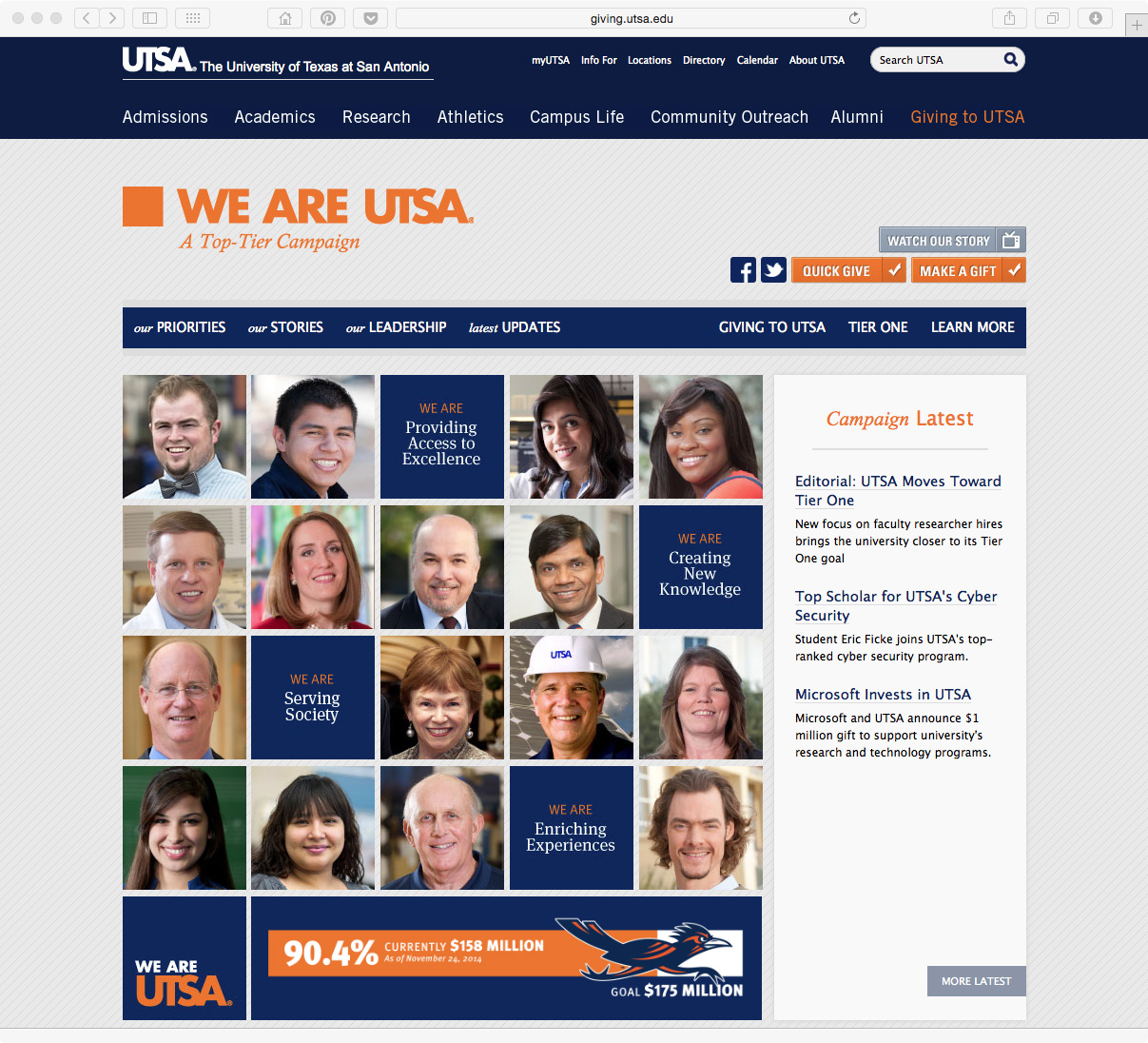
As part of their journey to Tier One status, the University of Texas at San Antonio (UTSA) launched a capital campaign. To support the campaign, the University's Development team wanted an online presence that could serve two purposes: first, to be utilized as a talking point during meetings with potential donors and second, to act as an information hub to keep the public informed of the campaign's progress.
CHALLENGE
How can the University have a website that both informs the public about the progress of the capital campaign while also providing visuals and talking points for development officers who are soliciting donations?
RESEARCH
What information would be most valuable to development officers?
I interviewed several development officers and UTSA's vice president of development to determine what type of information they needed when meeting with donors. During the development stage, we solicited input from several donors to determine if they found any value in the information being provided.
In total: 7 Interviews + 8 Survey Responses
KEY INSIGHTS
01 High demand for up-to-date information
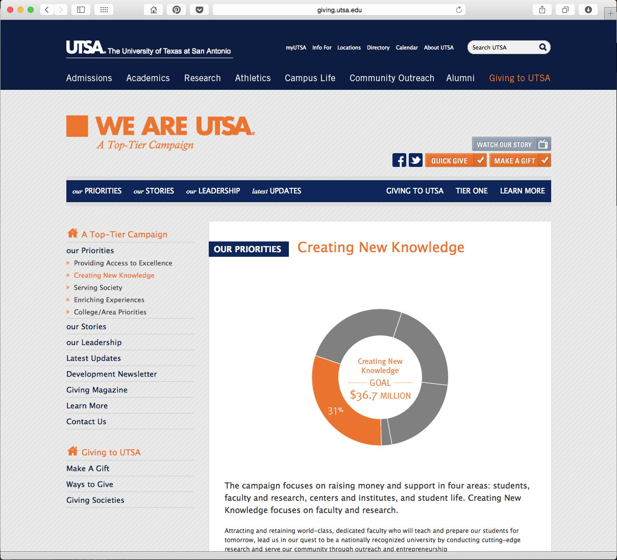
02 Need for easily edited figures
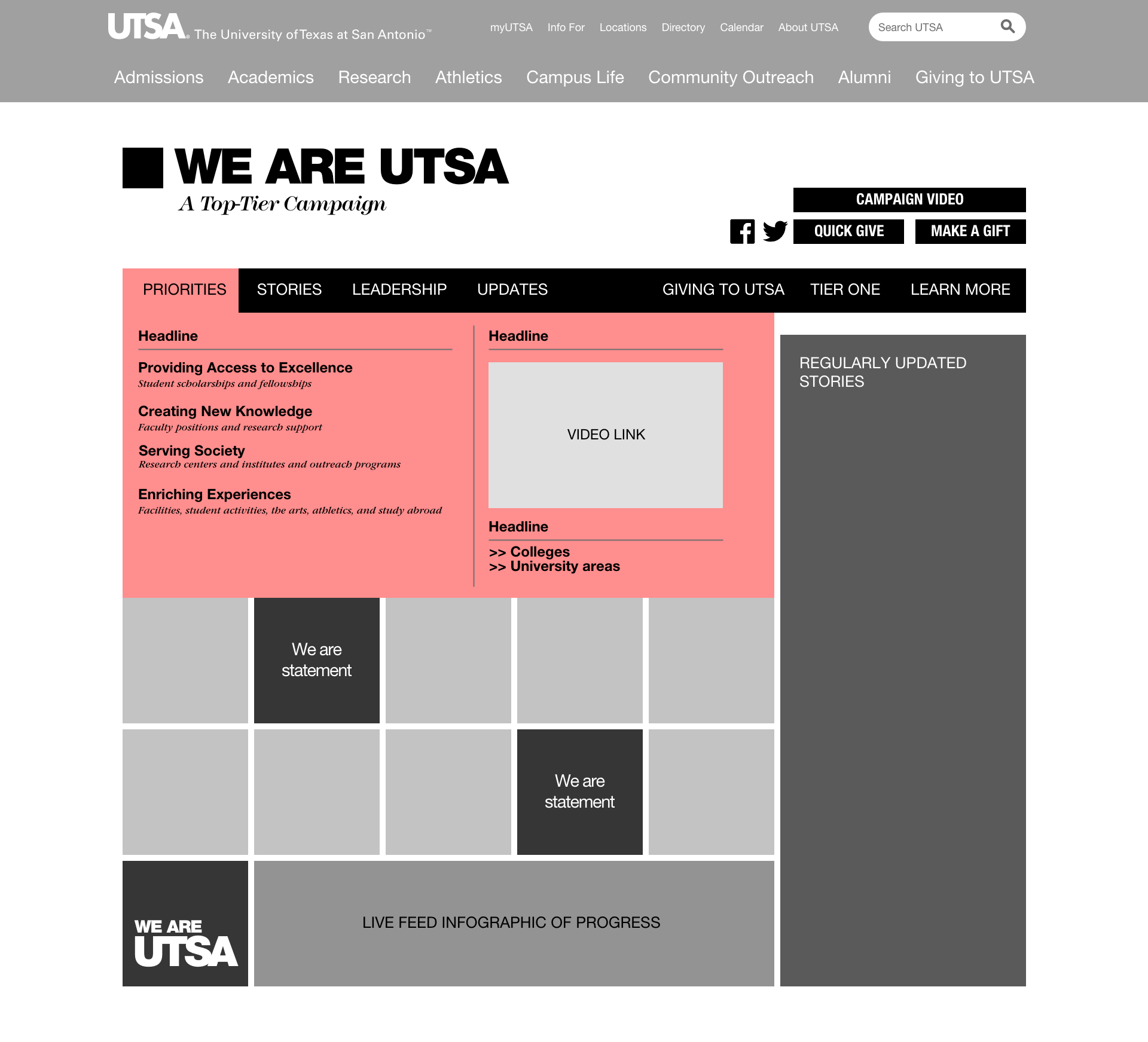
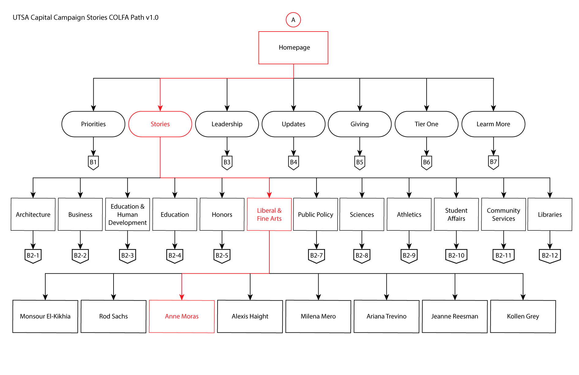
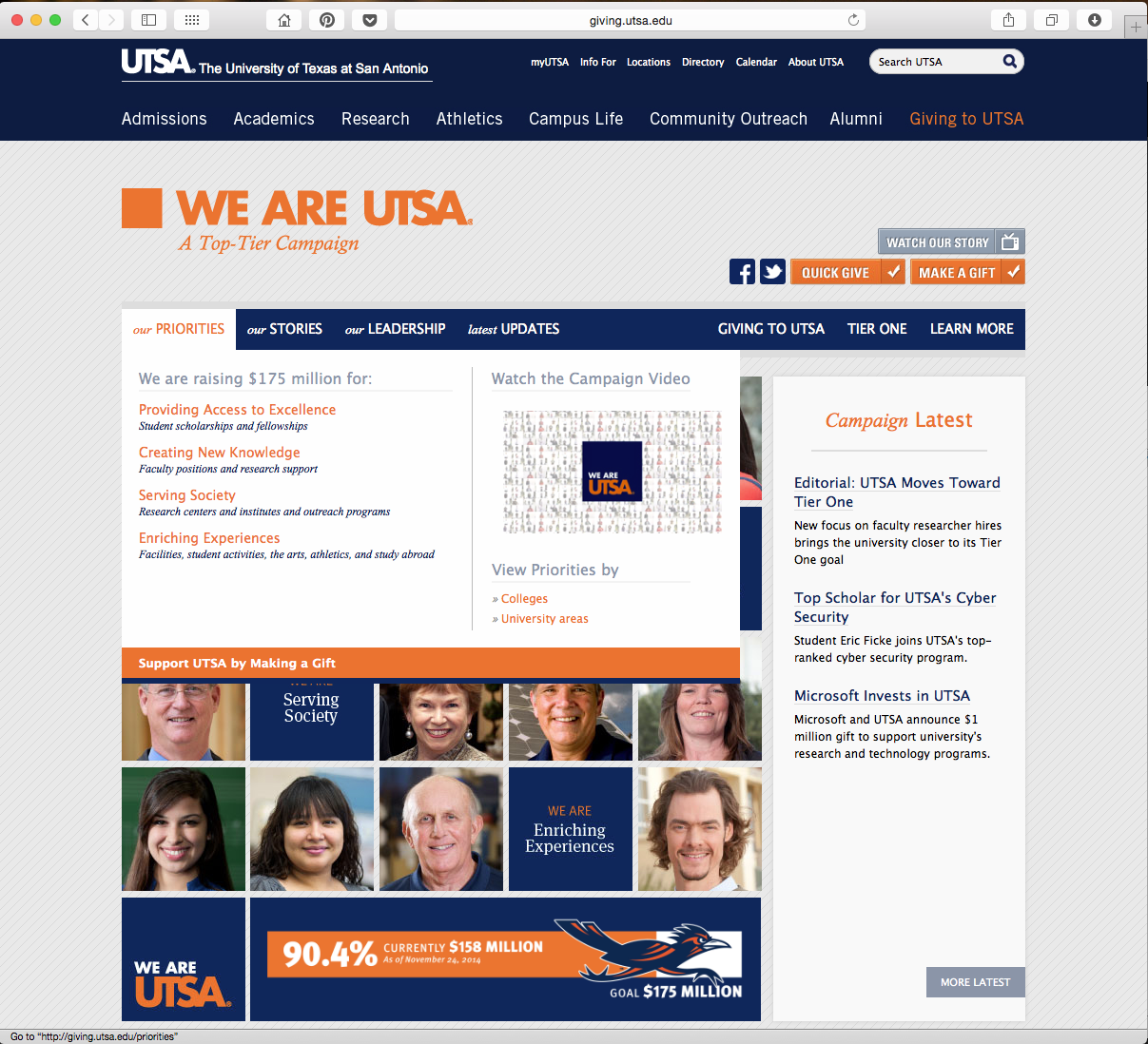
03 Desire for intuitive navigation
04 Need responsive version for mobile presentations
INFORMATION
"Would love to have access to information that is always up-to-date so I can showcase our progress to donors."
CECE, DEVELOPMENT OFFICER
NAVIGATION
"Sometimes even I get nervous when I'm meeting with high dollar donors. I need easy navigation that is intuitive so there is less of a chance for me to make a mistake and end up on the wrong page."
SEAN, DEVELOPMENT OFFICER
AESTHETIC
"I love the design of the screen on the iPad. It would be great if the images and information were larger so everything was easy to read when I'm meeting with a representative from the university."
JESSICA, DONOR
TARGET AUDIENCE
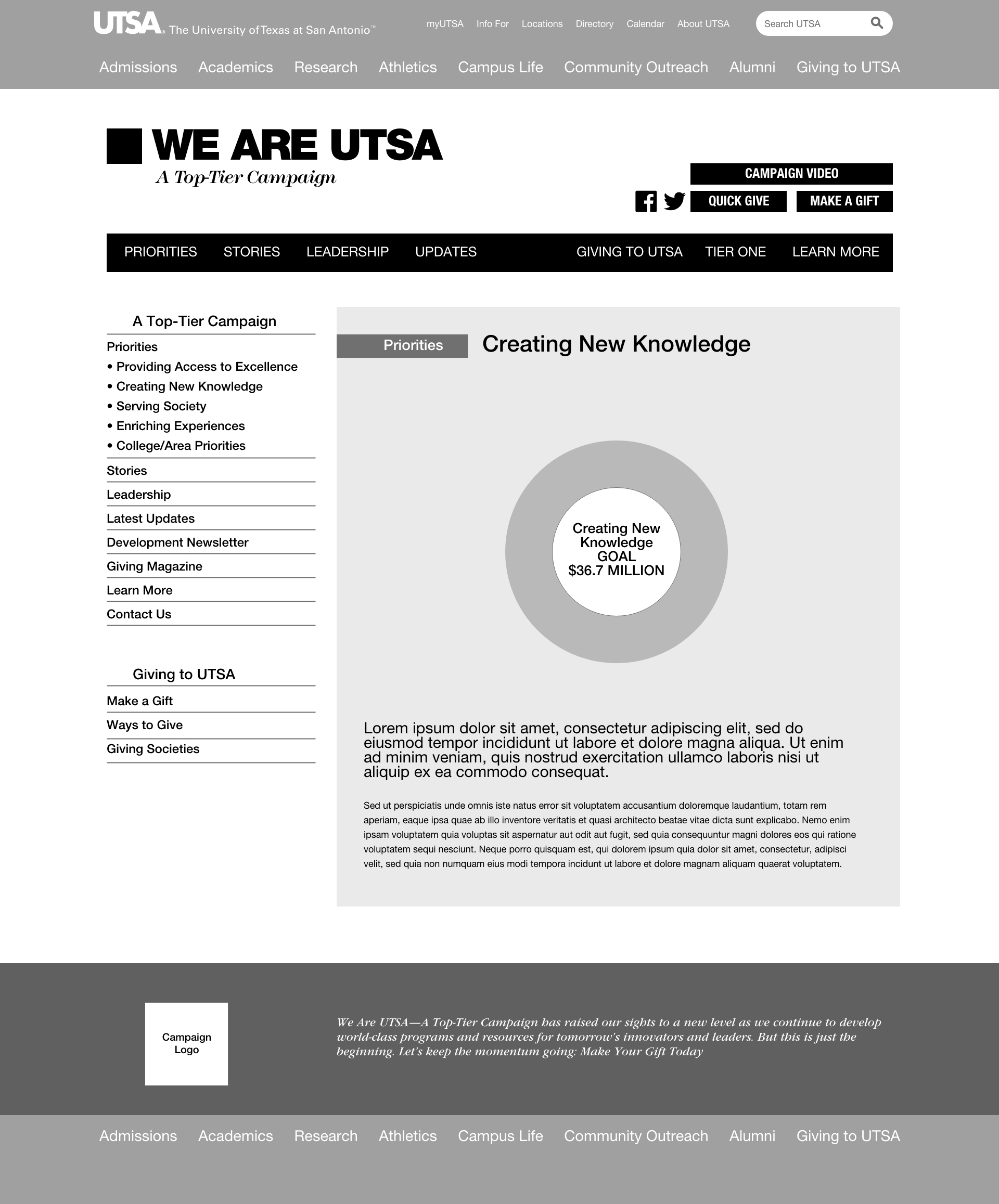
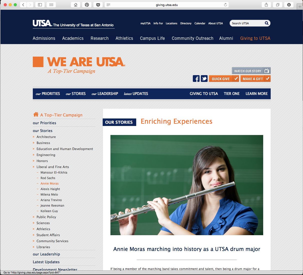
Because the demographics of potential site visitors were so vast (current and potential students, faculty, staff, donors, government officials, and the general public), my team and I determined that we would keep the information universally approachable by eliminating the use of jargon or acronyms. We designed and produced a brand-compliant, visually pleasing layout that displayed information in a way that would appeal to all three groups of users.
SOLUTION
I collaborated with the University's web teams throughout the ideation, design, and production phases of the site. The design was visually enhanced by elements of the University's brand standards, which we developed concurrently with this project.
Keeping the campaign's fundraising accomplishments up-to-date was important. To ensure donation numbers were always accurate, we established a process for the University's web team to update the dollar amounts weekly, providing visitors with the most current information possible.
RESULTS
The site was well-received by UTSA's Development Officers, as well as current and potential donors. Ultimately, the original $150 million capital campaign goal was met earlier than expected, and the campaign concluded with a total of $180 million committed to the University.
www: giving.utsa.edu
← prev
next →
Copyright © 2024 Eleazar Hernández | All Rights Reserved

